Debuting Today for Android and Launching Group Chat

Hello, Android. Hello, World.

We are thrilled to announce that Vurb is now available for Android—and, is now available all over the world. Finally, we can all Vurb together.
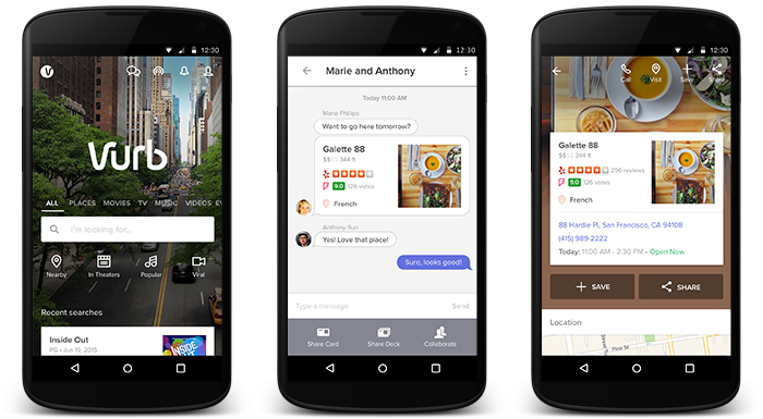
android-screenshots

Our team has been working tirelessly to make our new Android app everything you’ve come to expect from us and more. It has all the bells and whistles the iPhone version has but is carefully crafted with a Google finish. We’ve kickstarted our Vurb community with iPhone users and can’t wait for Android users to join in. Create and share Decks, like your own bucket lists and favorite places, music, movies, and more. Follow other Vurbies and make plans with each other. There is so much more we can do now that we are all together.

But wait, there’s more! Introducing Vurb Chat.

After listening to your feedback, we learned that you love using Vurb to build Decks and find places to go, but that Vurb would be even easier to use if you could chat directly into the app. It’s no secret that group texts can be underwhelming and complicated. Vurb Chat changes that. Now, you can communicate in a much more functional way by having the ability to share all of your Vurb Cards and Decks directly in the app.
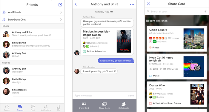
For instance:

Plan a Night Out Together
Suggest a place to go in a Vurb Chat, and your friends will have directions, photos, and reviews. You can both book a reservation, purchase movie tickets, then call an Uber or Lyft, all within the app from the chat screen.

Build Bucket Lists Together
Build “Concerts To See”, “Favorite TV Shows to Binge On” or “World Wonders to Visit” with your friends and loved ones.

Plan Trips Together
No more spreadsheets! Share, edit, and comment on Cards and Decks right from Vurb Chat so you and your friends can collectively create Decks.

Curate Local Favorites Together
Build favorite “Best Brunch Spots”, “Neighborhood Coffee Shops” and more. Share with friends who are visiting and looking for recommendations.

The possibilities are endless. Invite your friends to Vurb and change the way you chat forever.

The Future of Apps

We love apps. And we know the rest of the world does too. For instance, we’ve seen the booming rise of single-purpose apps in the U.S. and across the West. However, there are now over 1.5 million apps across the app stores that don’t communicate with each other. For users, choosing the right apps to use, or even knowing that they exist, is exhausting. Then, to get a task done like planning a night out, you have to hop back and forth between seven or more apps.

Taking the “constellation” of different apps and connecting them in a centralized hub will create a better user experience. We’ve already seen this model of plugging multiple services into one app work very successfully with WeChat, the top messaging app in China made by global Internet powerhouse Tencent—now also an investor in Vurb.

Vurb is available on Google Play, the Amazon App Store, and the Apple App Store in Global English. Stay tuned—there’s always more great stuff coming down the road.

Keep on Vurbin’
Bobby

Share this on: Share on FacebookTweet about this on TwitterShare on Google+Email this to someone

Vurb on the Apple Watch—Look Less, Do More

The mobile experience is evolving

It’s more important than ever to redefine the mobile experience as Apple and other companies expand from phones to wearable technology and beyond. The current model for searching on a mobile web browser or using multiple, siloed apps to access information and services is broken. It’s why I started Vurb. And, with the onset of new technology like wearables and other Internet-enabled devices, people will need apps that provide the most value possible when searching and getting things done on the go.

Vurb is listening

In February, we launched Vurb for the iPhone and are delighted at the response from users. Apple and TIME featured us as “Best New App” in addition to other great press and social media buzz.

We have spent time getting to know our users via feedback forums and on social media. The volume of feedback has steered us towards making enhancements and creating features you want on Vurb. We depend on our Vurb community to let us know how we can create the best user experience possible, and encourage you to keep the feedback coming!

Vurb is better with friends

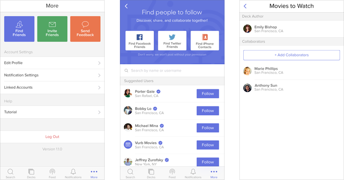
Vurb on the iPhone is now optimized for inviting, finding, and following friends. It’s one thing to do a search on Vurb, but users enjoy the experience even more if they can build and curate Decks together, share favorite Decks and Cards, or make group plans directly in Vurb. We encourage users to invite their friends and “Vurb” together.

Vurb expands to the Apple Watch

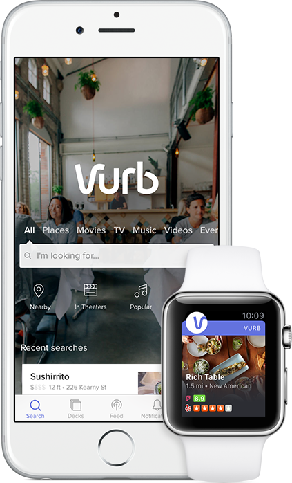
We are excited to enhance the Vurb experience by launching our Apple Watch app. Like the Vurb iPhone app, the companion app conveniently brings apps and services together in one place, eliminating the pain of toggling between apps to get things done, especially on a small screen.

With Vurb on the Apple Watch you can:

Plan on the iPhone, Do on the Watch

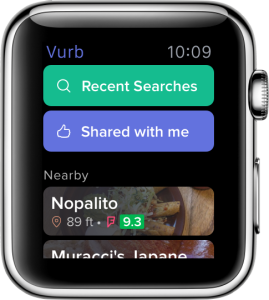
Use the Vurb app on your iPhone to plan a night out with your friends. Access recent Vurb iPhone searches on your Apple Watch without needing to take out your phone again. Whether you searched for a movie, event, or a museum Card on your iPhone, the companion app supports viewing summary information for those Cards.

Get Notifications and Shares

Never worry about missing out. The Vurb app on the iPhone integrates with the Apple Watch’s built-in notification system, allowing you to conveniently receive and respond to Vurb notifications with one tap. For example, when your friends “follow” you or share a restaurant Card, Vurb will beam that notification to your wrist.

View Nearby Places

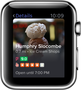
If you’re already on the go, you can quickly browse nearby places with the Apple Watch. For example, if you are looking for a place to eat dinner, you can see a list of nearby places on the Watch. Tap on a specific restaurant’s Card to view more information. Each Card contains summary information, such as address and phone number, Yelp and Foursquare ratings, and access to Apple Maps.

We eagerly await the opportunity to hear from the digital trailblazers and early users of Vurb on the Apple Watch. Please keep your feedback coming, and be on the lookout for more features, search categories, and other devices coming soon. If you haven’t already done so, we invite you to join our Vurb community today.

Thanks for using Vurb.

-Bobby

Share this on: Share on FacebookTweet about this on TwitterShare on Google+Email this to someone

The New Vurb App Is Here!

Remember the days of “surfing the web”?

It’s amazing how our world has changed with the evolution of Internet technology. I still remember the days of using dial-up Internet and surfing the web, moving from blue link to blue link, never knowing where I’d eventually land.

Today, we have more information at our fingertips than ever before – and rather than being tethered to a desktop computer, we’re doing things on our mobile devices in an app-centric world.

With the wealth of information available to us, we’ve come to rely on search engines, organizational tools, and intelligent assistants to help us locate and interpret all the information out there. But at the end of the day, we’re still dealing with information and services siloed from each other, whether it’s in the form of windows, tabs, or mobile apps.

So, I started Vurb to solve this problem, and we began with a mission to reinvent the notion of “Surfing the Internet” to bring fluidity and seamlessness to today’s fragmented experiences.

It’s more than just search – the entire mobile experience needs to evolve.

Last year, we unveiled our vision at Techcrunch Disrupt NY 2014, and winning the Startup Battlefield showed how much our mission resonated with the community. Soon thereafter, we raised our Series A and focused all our energy into making the mobile world more connected. Here’s why:

vurb-infographic

  1. People are using their mobile devices more than ever. Each month we spend 30 hours on our phone using over 29 apps and sending over 760 text messages. A good portion of that time each month is spent on social and search apps alone. (See infographic)
  2. Mobile search and navigation is broken. Apps provide us with rich experiences, so we use browsers and conventional web search as a last resort. However, there no good way to search across apps and accomplishing simple tasks can involve multiple, siloed apps that lack shared context.
  3. Finding apps is tough. With over 1.4 million iPhone apps available, discovering the right app to use at any one time is incredibly difficult. People have to already know which app to download or rely on recommendations. As a consequence, app publishers are purchasing ads everywhere just to get found.
  4. Sharing is cumbersome. Once you finally find what you need, making plans or suggestions with friends is difficult to communicate and share. We text names of places, movies, and other information back and forth, which still requires our friends to launch their own apps to fill in the blanks.

We need apps because the companies making them are the best at what they do. What’s missing is a contextual layer that brings everything together. We’ve started to see recognition of the importance of apps working together with the rise of app deep linking as an industry trend.

Enter Vurb

If the mobile experience needs to evolve, what would that look like? How do we connect all of the apps and services out there in an intelligent way?

Our solution revolves around the idea of the Vurb Card. It’s a portable, interchangeable, and intelligent medium that connects you to information and relevant apps and services. By bringing together Cards across multiple categories (e.g., places, movies, music), we’re helping you get things done – all from a single place.

The Vurb Way:

  1. Cohesive search – Find places, movies, TV, music, and more with information like location, trailers, ratings, rankings, and reviews.
  2. Actionable information – View ratings and reviews, and movie trailers; plan activities and book services, reservations, and tickets.
  3. Sharable formats – With a simple swipe, share rich Vurb Cards rather than antiquated text messages. Combine Cards into Vurb Decks to share everything from plans to lists of your favorite music, videos, and more, and follow your friends and other Vurb tastemakers.

At the end of the day, we’re here to create an amazing experience around all the wonderful apps and services that are out there today.

I’m very excited to announce that Vurb is now available for download in the Apple App Store. We deserve a better mobile experience, and we’d love you to join us in our mission.

-Bobby

Share this on: Share on FacebookTweet about this on TwitterShare on Google+Email this to someone

Announcing Vurb’s $8M Series A Funding

“Surfing the Internet”

In a world with hundreds of millions of websites, we use search engines to generate lists of blue links, multiple browser tabs to display nuggets of information, and other tools to piece the information together.

It gets worse on mobile, where we struggle between broken mobile web experiences and hard-to-discover single purpose apps.

Whatever happened to the promise of “surfing the Internet?” Rather than a connected experience, we’re hopping from site to site or app to app, each service unaware of others.

What if we could break down these silos and deliver a more fluid experience around web and mobile search, browsing, and social interactions?

Moreover, how can we create a more intelligent and contextually aware experience for getting things done in one place?

Vurb was founded with the mission of evolving how we find, navigate, and interact with the wealth of data and services on the Internet. When we bring services, actions, and people together, we can explore new opportunities around this interconnected graph.

Last year, we raised over $2M from thought-leaders like Max Levchin, Drew Houston, Naval Ravikant, and funds including Atlas Venture, Caffeinated Capital, Crunchfund, Data Collective, and Susa Ventures.

A few months ago, we announced our vision at TechCrunch Disrupt NYC and were honored to bring back the Disrupt Cup in a competition that has launched companies like Mint, Yammer, Dropbox, and Pied Piper. Post-Disrupt, we’ve been blown away by the level of interest, support, and encouragement for our mission.

Our partnership with Redpoint

To accelerate our development, we’re excited to announce our $8M Series A funding led by Redpoint Ventures, with participation from Stanford University alongside many of our seed investors.

Geoff Yang, founding partner at Redpoint, will be joining me on our Board of Directors. Redpoint has lots of relevant experience in our space, and I couldn’t be more excited to work with a partnership that shares our vision.

The adventure continues

Since Disrupt, we’ve been working non-stop to realize this vision of connected services. We can’t make this happen without support from the community – our users, developers, and service partners. Let’s work together to redefine “surfing the Internet.”

Our search, browsing, and sharing experience is currently in beta for services and apps around places, movies, and media. Thank you to all of our beta users and their feedback as we develop this experience. For those of you still on our waiting list – we’re moving as fast as we can and thank you for your enthusiasm!

Look out for more exciting announcements, but in the meantime, we are looking to expand our team in San Francisco. If you’re passionate about changing the way we use the Internet and building product that you will use every day, come join us.

-Bobby

TL; DR: Got funding, building product, we’re hiring, more invites soon 🙂

Share this on: Share on FacebookTweet about this on TwitterShare on Google+Email this to someone

About Vurb

Our Mission – to intelligently organize and connect all the services together on the web

The ways we find, interact, and consume websites and services have remained largely unchanged over the years. Browsers render faster; mobile devices have more apps, and yet we still adhere to a model where every website or service has its own unique way of organizing information. At the same time, the number of online services available and the number of services we use has steadily increased.

We rely on our knowledge of each of these services as well as general search engines to index the entire web. However, for the most part, we’re still accessing these services one at a time, with windows and tabs to help us stay sane.

At Vurb, we’re proposing something new. Let’s challenge all the assumptions out there and reimagine how we fundamentally use the web. What if we could be smart about how you arrive at different services, contextually understand your actions, and then connect you with the most relevant information? Once we do that, what if we could also help you better organize and share that information in a coherent way?

Our goal with Vurb is to be your smarter interface to the Internet. Let’s change things up. Question everything. (Are you an engineer? We’re hiring.)

-Bobby
Founder, Vurb

Share this on: Share on FacebookTweet about this on TwitterShare on Google+Email this to someone